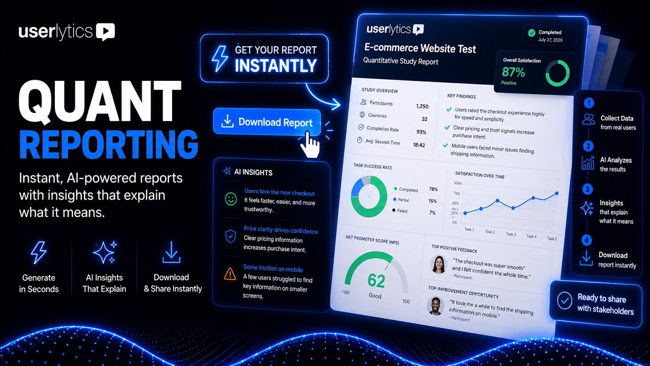
Quant Reporting turns your study’s quantitative data into a polished, presentation-ready DOC report in one click. Instead of exporting raw CSVs and rebuilding charts by hand, you get a fully formatted document with every chart paired with an AI-generated summary of what the data means — ready to forward to stakeholders.
Report generation happens asynchronously in the background, so you’re free to keep working, close the tab, or move to another study while it’s created.
Note: Quant Reporting is available once your study is marked complete. The AI-generated summaries included in the report are currently in BETA.
How to Generate Your Report
1. Open a completed study from your dashboard.
2. In the left sidebar, click Metrics.
3. In the top-right corner, click Generate Report.
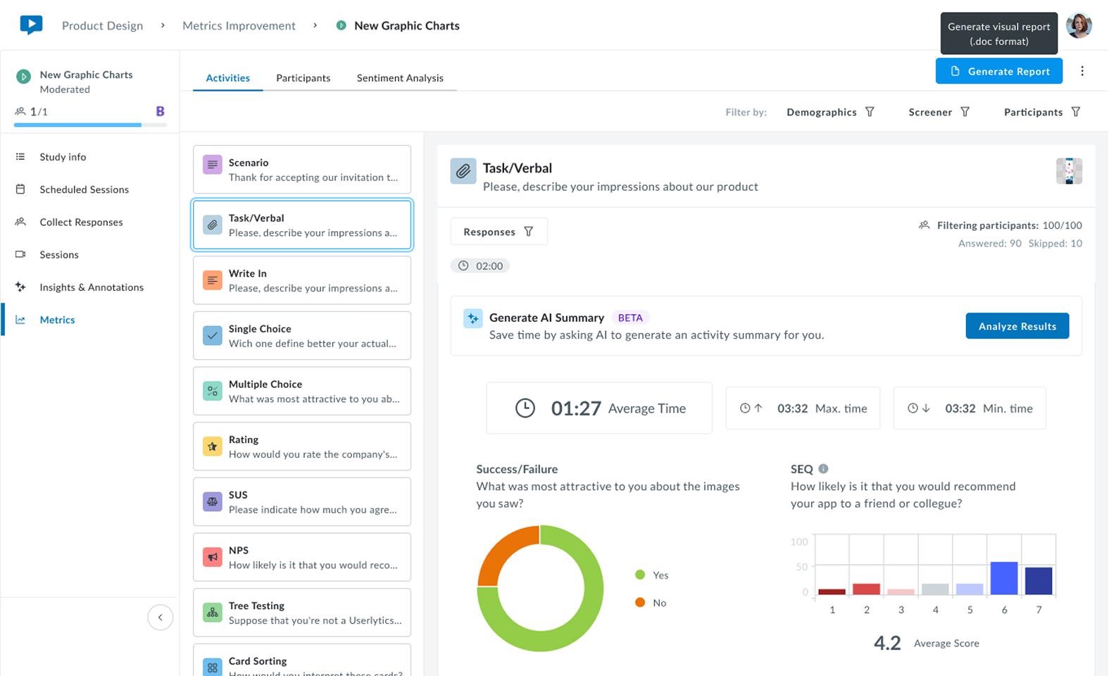
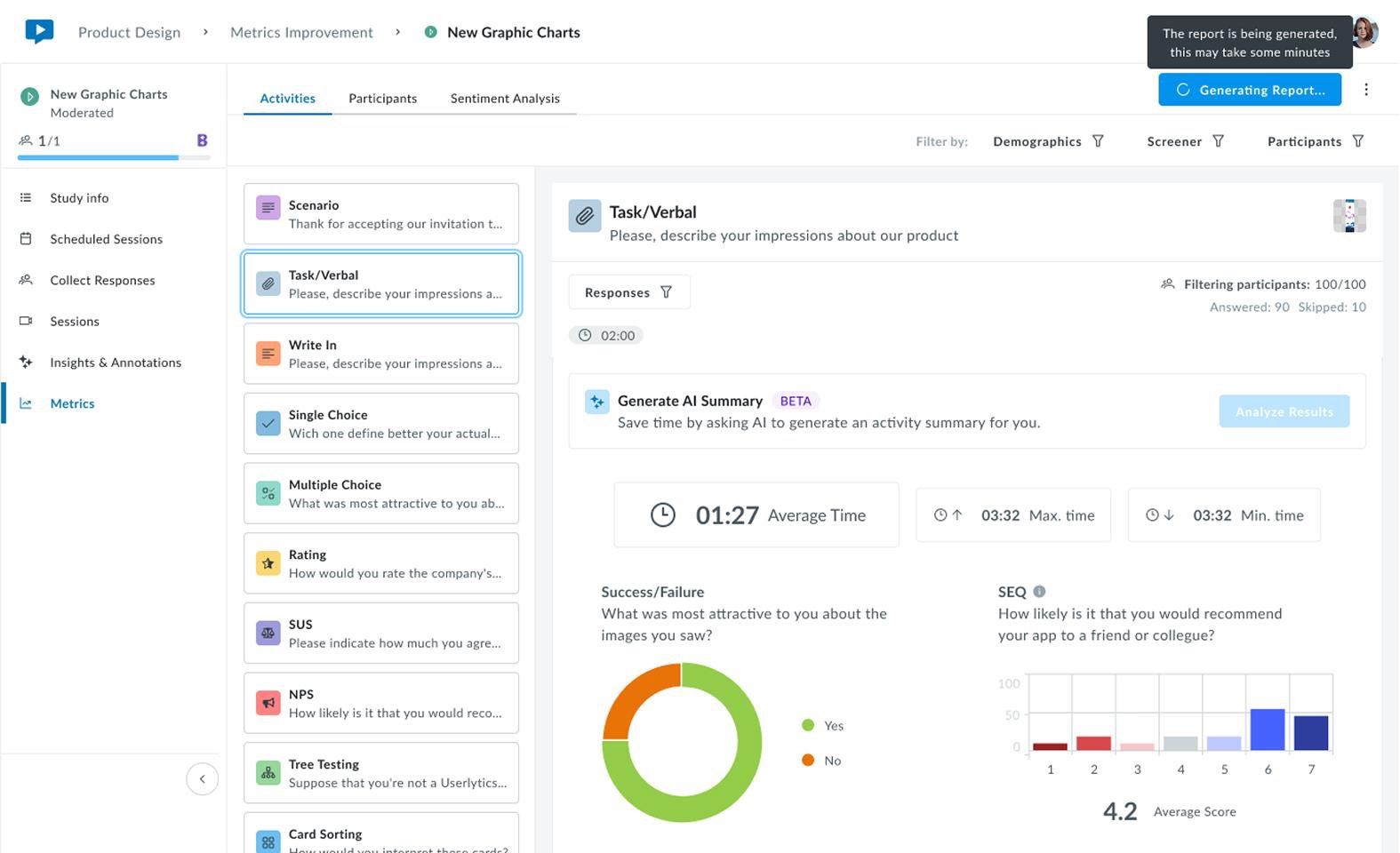
4. The button changes to Generating Report while Userlytics compiles your data and AI insights in the background. This can take a few minutes — feel free to navigate away and keep working.
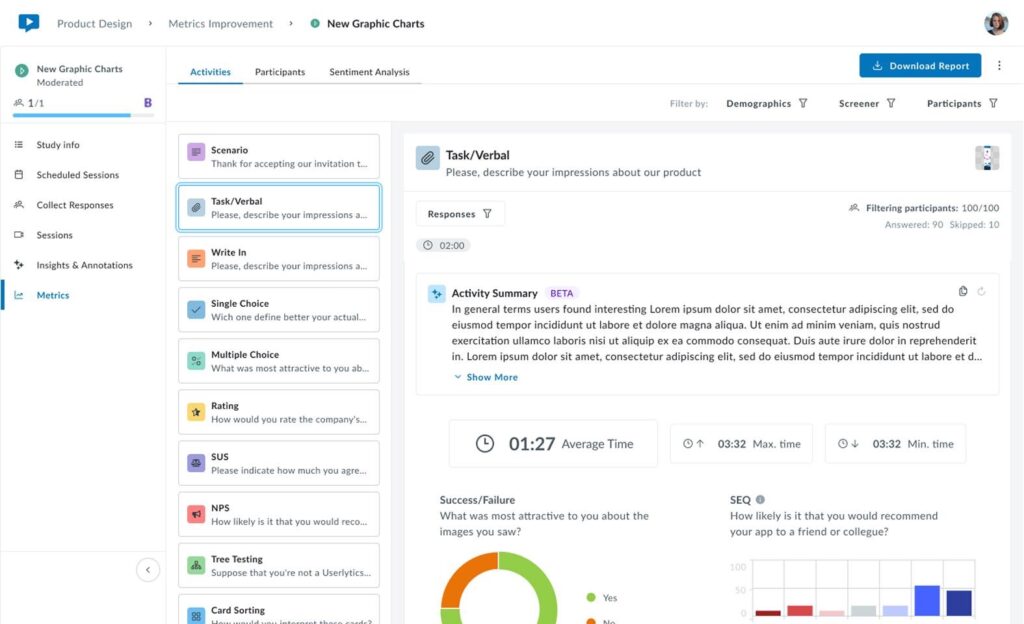
5. Once it’s ready, the button changes to Download Report. Click it to download your DOC.
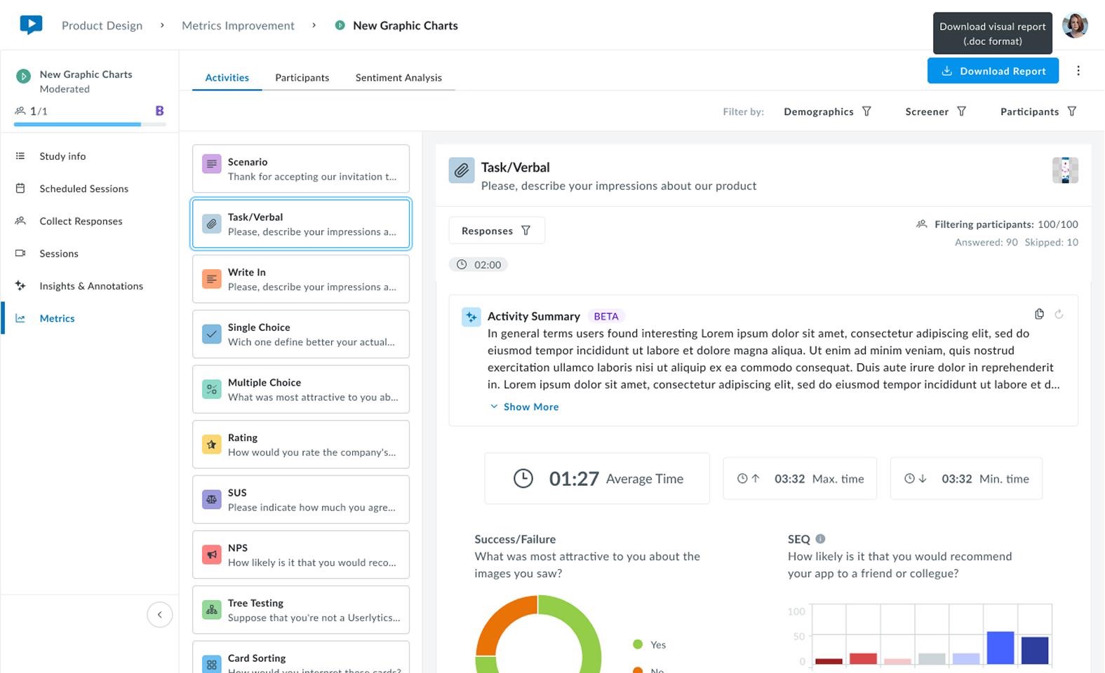
You’ll also see a notification in your study’s Study Pulse timeline once the report is ready to download, so you don’t need to keep the Metrics tab open while you wait.
What’s Included in the Report
Each supported activity appears with its visual chart alongside an AI-generated Activity Summary — the same plain-language interpretation available from the Generate AI Summary banner above each activity’s chart in Metrics. Rather than just showing what happened, the summary tells you what it means: patterns, standout results, and areas worth a closer look.