AI Chart Summaries is a toggle feature available within the Metrics section of your Userlytics studies. When triggered, it generates an AI-powered narrative interpretation of your activity data, surfacing patterns, top preferences, areas of low engagement, polarization signals, and key takeaways automatically.
The analysis is human-triggered and context-aware: it runs only when you click the button, and it adapts to whatever filters you have active at the time.

Note: AI Chart Summaries is currently in BETA. It is available for the following activity types: Single Choice, Multiple Choice, Rating, Write In, NPS, SUS (System Usability Scale), and Card Sorting.
How to Access AI Chart Summaries
1. Open a study from your dashboard.
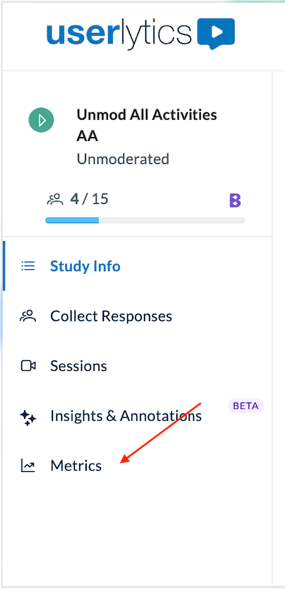
2. In the left sidebar, click Metrics.
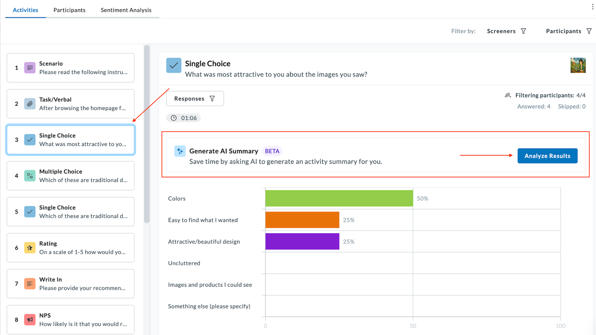
3. Select an activity from the activity list on the left (e.g., Single Choice, Multiple Choice, NPS).
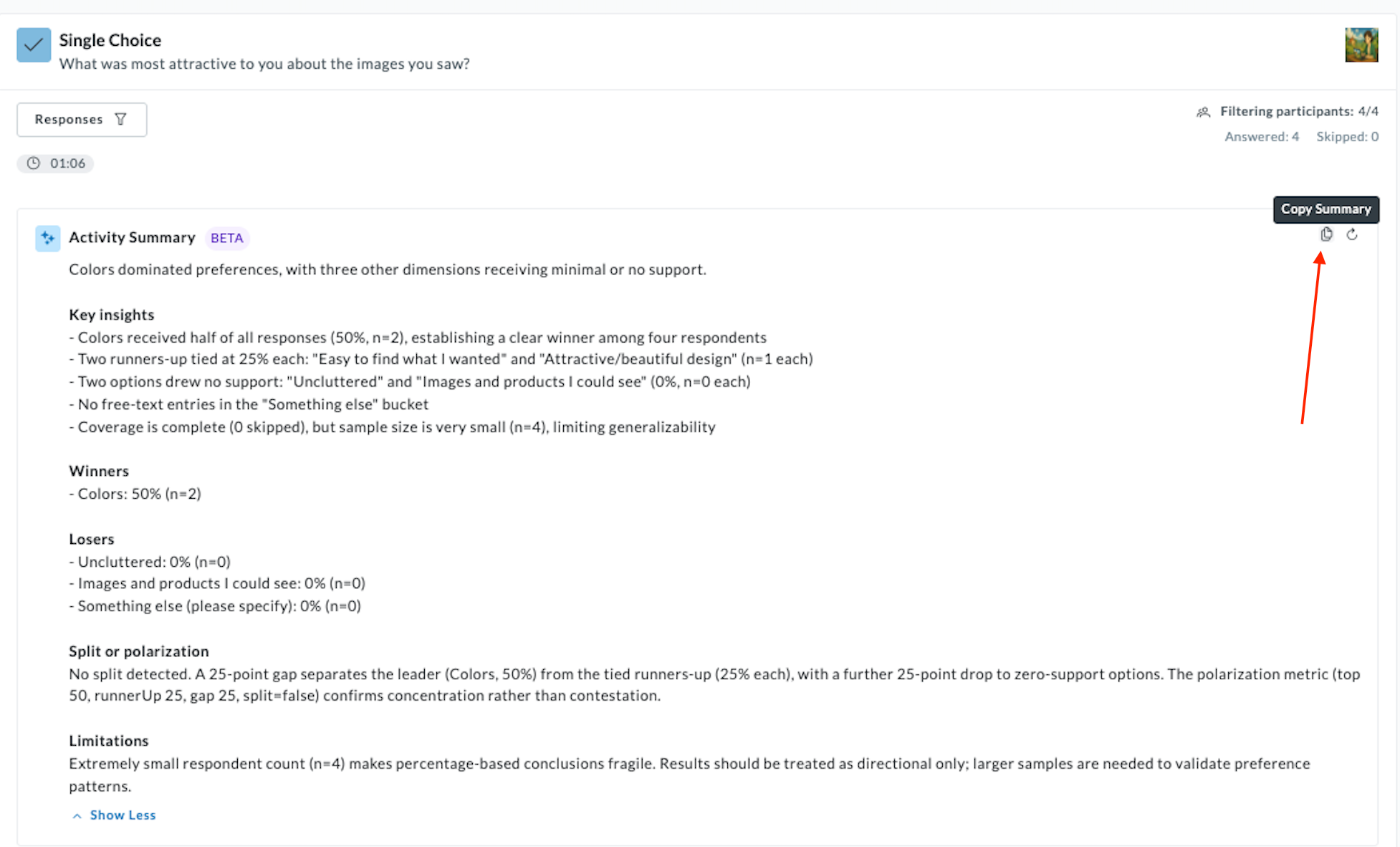
At the top of the activity results panel, you will see the Generate AI Summary BETA banner. Click the blue Analyze Results button on the right side of the banner.
Reading the Activity Summary
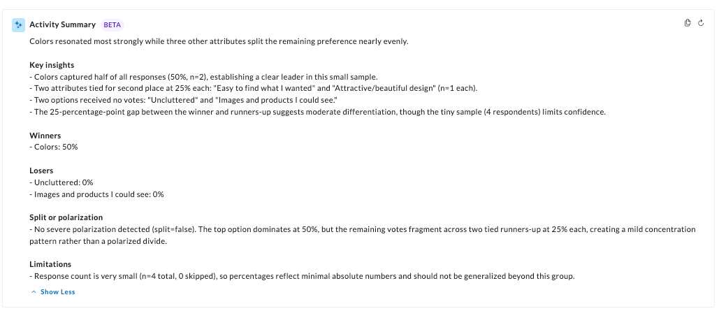
Once generated, an Activity Summary appears above the metrics chart, providing a consolidated interpretation of the data automatically.
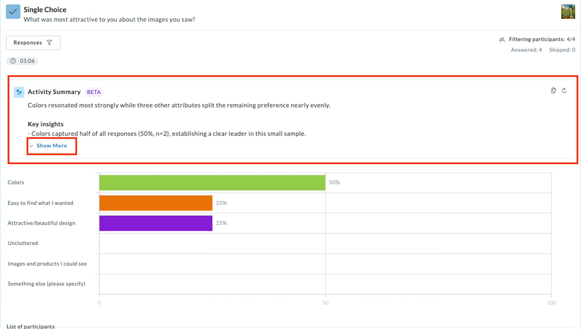
Click on the Show More button to read the full summary, and then Show Less to collapse.
Copying the Summary
To copy the full summary text for use in a report or presentation:
- Hover over the Copy Summary button that will appear in the top-right corner.
- Click Copy Summary (or the clipboard icon).
- The full summary text is now on your clipboard, ready to paste into any document or presentation.
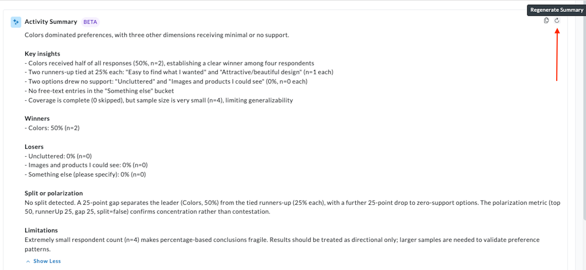
Regenerating the Summary
If you want the AI re-run analysis, simply click the Regenerate Summary icon (circular refresh arrow) in the top-right of the Activity Summary panel. The summary will re-run against the currently active data and filters.
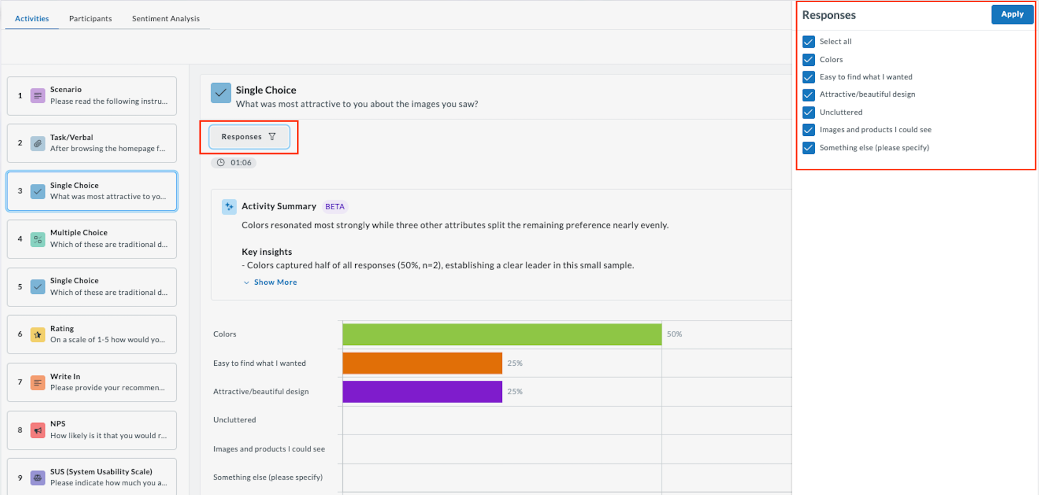
Responses Filter
Click the Responses button above the chart to show or hide specific answer options in the visualization. This filter affects which responses are displayed in the chart, and will be reflected if you regenerate the summary.
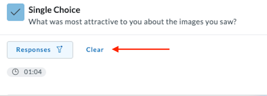
To remove active filters, click the Clear button that appears next to the Responses filter label.
Screeners Filter
Click Filter by: Screeners in the top-right of the Metrics view to filter results by screener question answers (e.g., by gender or language proficiency).
Set your preferences and click Apply.
Participants Filter
Do the same to filter by Participants to filter results by specific audience segments or individual participants.
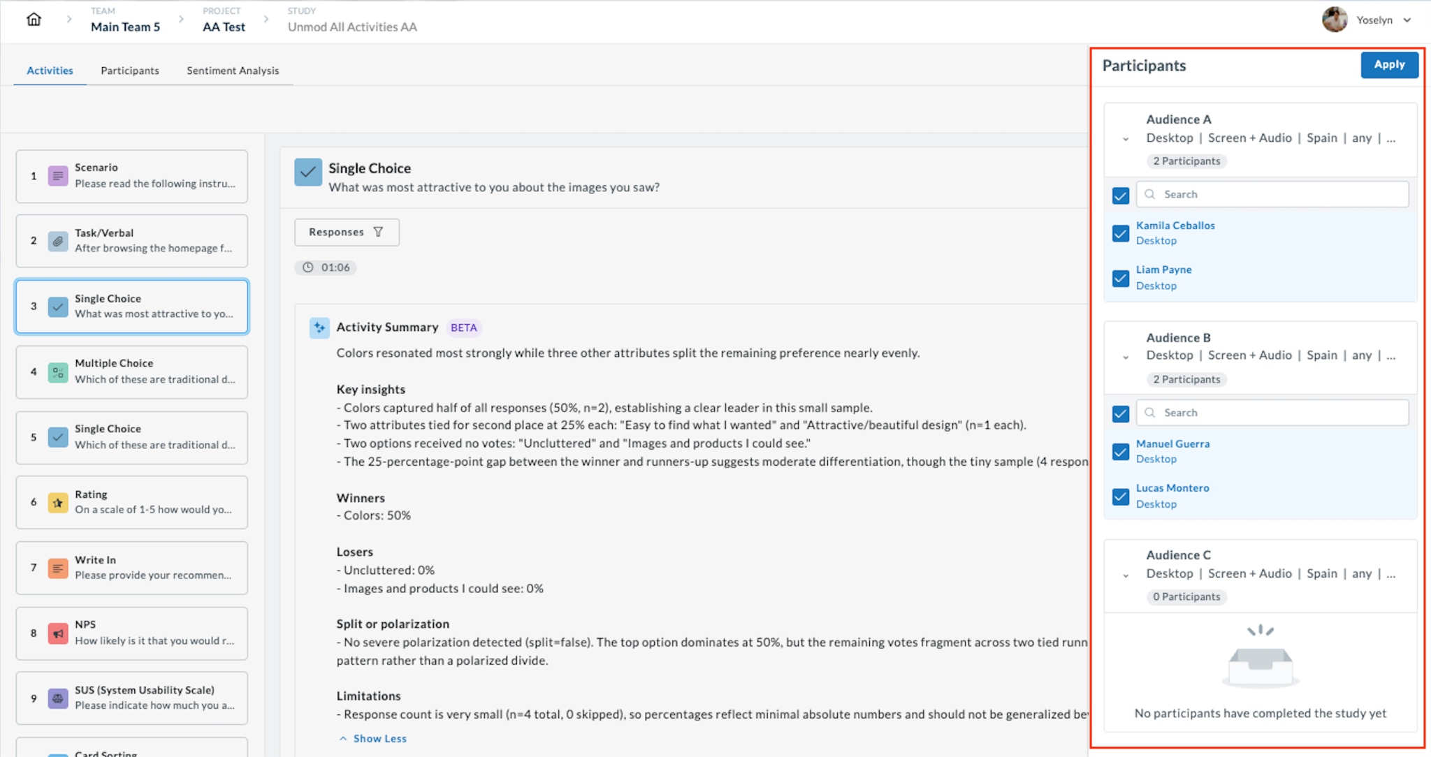
Select the participants you want to include and click Apply. You’ll see the results and can Clear anytime.
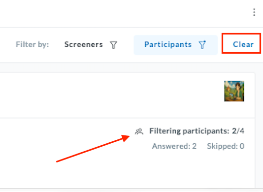
The participant count at the top of the results panel updates to show how many participants are included (e.g., Filtering participants: 2/4).
Supported Activity Types & What AI Analyzes
The AI does not apply generic logic to every chart. The backend selects specialized analysis patterns based on the activity type.
Single Choice & Multiple Choice
Highlights Winners (top options) and Losers (zero-response options). Detects Split or Polarization, signaling when responses are divided rather than concentrated. Provides a sample size caveat when participant counts are low.
Rating
Goes beyond the average score to identify whether responses cluster around the mean or split between extremes. Surfaces the distribution pattern to reveal hidden polarization.
Write In
Sentiment & Theming: Groups open-ended text responses into thematic clusters and identifies the most common patterns. For example: “70% of participants mention frustration with the registration process.” Transforms 100+ comments into 3–5 key takeaways.
SUS (System Usability Scale)
Goes beyond the final composite score to identify relative friction points across the 10 standard SUS questions, surfacing which specific questions pulled the score down most.
Card Sorting
- Heatmap Analysis: Identifies high-dissatisfaction cells in the Similarity Matrix, showing where user mental models clash most.
- Semantic Merging: Automatically groups similar category names (e.g., “Cars” and “Automobiles”) to reduce noise.
- Cluster Detection: Identifies items that participants pair together most often, above a configurable threshold.
Tree Testing
Path Analysis: Pinpoints exactly where users deviate from the intended success path and at which navigation level (e.g., “Most failures occur at Level 2”). Also validates first-click efficiency (e.g., “80% made the first click in the correct category”).
NPS
Provides context by comparing the current NPS score against available historical data or sector benchmarks, helping you understand whether the score is improving, declining, or outperforming your industry.