
There are more than 27 million eCommerce websites on the internet, each competing against each other for the attention of customers, so it’s no wonder that you are struggling to get as much website traffic as you hoped.
In such a saturated landscape, 21% of small businesses say low traffic is their biggest website challenge. The good news is that getting more site traffic doesn’t require an endless money pit or a complete redesign – small user experience (UX) changes can go a long way!
At the end of the day, the user experience is what matters, and if you design a website that aligns with the needs of your customers, you can create an online shopping experience that naturally leaves shoppers wanting to return.
Top 5 Ways to Increase the UX of Your Online Store
Nowadays, growing an eCommerce business can feel like a never-ending battle. Even if you’ve finetuned your product offering and created an attractive website, success doesn’t happen overnight.
The trick is to consider exactly what users are looking for when they arrive at your website and make changes to improve their browsing experience. If you are using quality website templates that make your website easy to navigate and visually appealing for users, you are already most of the way there.
To give your site that extra push, here are a handful of tweaks you can make to optimize the user experience and help keep traffic flowing.
1. Incorporate White Space
When it comes to eCommerce websites, it can be easy for them to feel overcrowded and this can have a big impact on the browsing experience. This is where white space comes in. White space refers to the blank space around every element on a page that helps break up the page and steer the user’s attention towards the desired action.
Being able to effectively incorporate white space into a page is a powerful skill that can transform the user experience. If the page is well spaced and allows the eye to naturally follow a logical navigation path, it can be a much more enjoyable experience and help people find exactly what they’re looking for in a fraction of the time.
Some key areas to consider when implementing white space are the navigation bar, call-to-action buttons, and image margins. Since these areas are crucial parts of the web page, if they appear crowded, it lacks professionalism and can make the browsing experience feel more stressful.
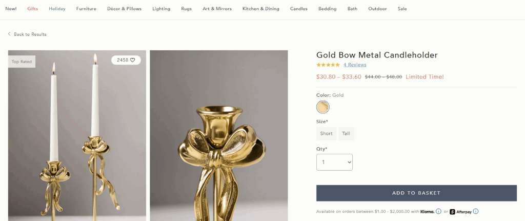
(Image source: Anthropologie)
2. Optimize your Product Descriptions
When shopping online, 87% of customers feel product content is the most important factor since they cannot physically see the item. This is the page where a user will decide whether or not they want to purchase the product, so your product pages need to contain plenty of information to sway them in the right direction.
Start by ensuring that your product titles are well-crafted. When a shopper is browsing through your range or has run a search to find exactly what they are looking for, the product title should immediately make it clear what they are looking at. Although you want to avoid keyword-stuffing, aim to get in the important phrases that show off the benefits of the product.
The body of text you write up is your opportunity to tell shoppers exactly why they need this product and what features are on offer. To build familiarity and help make the browsing experience as seamless as possible, it is recommended that you follow the same tone of voice and page structure across your website.
When you have finetuned your product descriptions, it is worth carrying out content testing to evaluate how much the copy resonates with your audience and whether it drives users towards the desired action. Platforms such as Userlytics offer qualitative testing tools which analyze participants’ tone when looking at a page and the usability of the site.
3. Add FAQ Sections
When users are quickly scanning a page to answer a question they have, a frequently asked questions section can save the day. Grouping together common queries on topics such as delivery options, return policies, or product care information means the user experience is enhanced and the pressure on customer support employees is reduced.
The FAQs should be short and snappy, containing a clear question, a paragraph or so in response, and internal links to further information that a user can go to if they need more detail.
From a UX perspective, including an FAQ section on each page helps shoppers find exactly what information they need in an instant. If they had to dig through various levels of navigation or resort to contacting customer support, it could quickly leave them frustrated and risk cart abandonment.
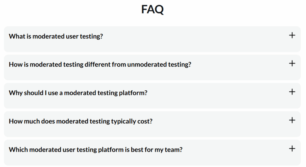
(Image source: Userlytics)
4. Improve Page Load Speed
If a user lands on your site and is faced with a lag, it can significantly increase the likelihood of them leaving before they’ve even interacted. In fact, as little as a one-second delay in page load time can lead to a 7% reduction on conversions.
As well as being incredibly frustrating for shoppers, poor page load speeds can actually reflect on your brand image. If your site is not performing well, this can appear unprofessional and low-quality – not traits that are going to make shoppers feel comfortable handing over their payment details.
There are various improvements which can be made to transform the website from a UX perspective. Tweaks such as compressing image files, cleaning up code, and implementing caching are all effective ways to speed up page load times and minimize the likelihood of losing your website traffic.
5. Add Alt Text to Images
It’s no secret that having high-quality lifestyle imagery on your product pages can transform your eCommerce success, but have you added alt text to your images?
Alt text, short for alternative text, is not visible on the surface level of a page, but makes a page more accessible for visually impaired users and those using screen readers. It allows them to access a description of what the image depicts, making your website more accessible to all users and creating a more inclusive shopping experience.
When writing alt text, the key is to include as much detail as possible. If you are struggling to get started, imagine describing the image to somebody in the room who can’t see it.
To check how inclusive your website currently is, carry out comprehensive accessibility testing to find out where improvements are needed.
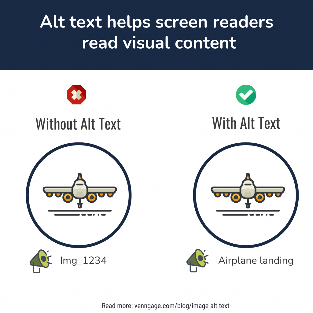
(Image source: Venngage)
How Small Changes Can Achieve Big Results
Now that the web is brimming with eCommerce retailers competing for the attention of shoppers, it can be harder than ever to get your website off the ground.
If you are not seeing the website traffic you’d hoped for, it’s time to put yourself in the shoes of your shoppers and do what it takes to give them exactly what they are looking for.
From utilizing white space to including alt text, there are a range of small changes that you can make to improve the UX and transform your online presence.